MR.T travel App Interface Design
FANXING COMPANY
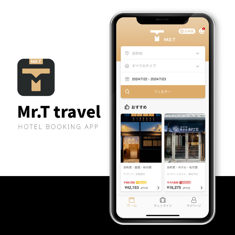
MR.T travel is an app for Tanimachi Kun Travel, a hotel business under the Fanxing company. Through the app, customers can book hotels owned by the company.
Since the app was launched not long ago, there are still many areas that need improvement. As the company’s UI designer, my role is to work with the developer team to identify issues and come up with solutions and layout improvements.
# ISSUE 1
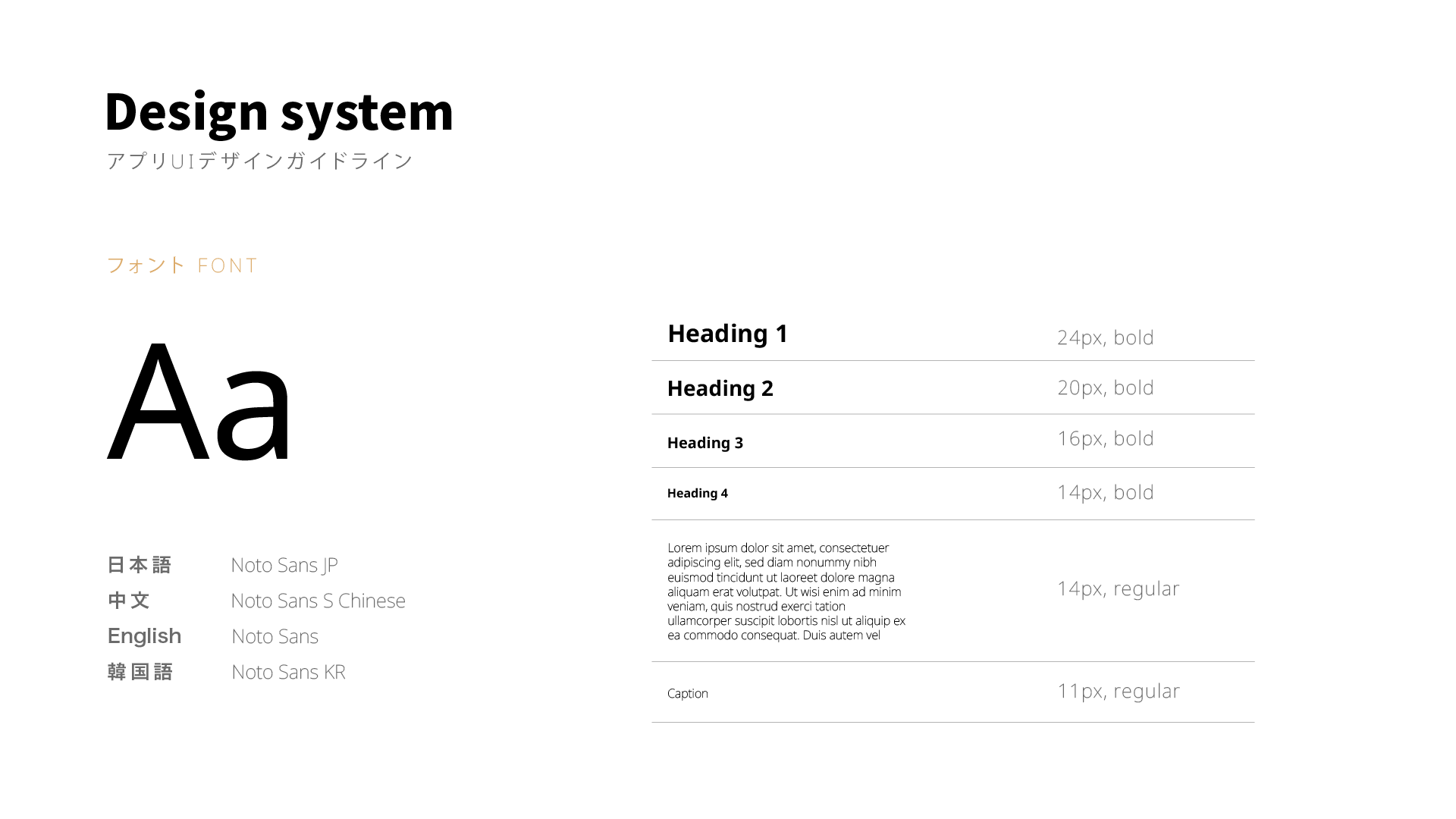
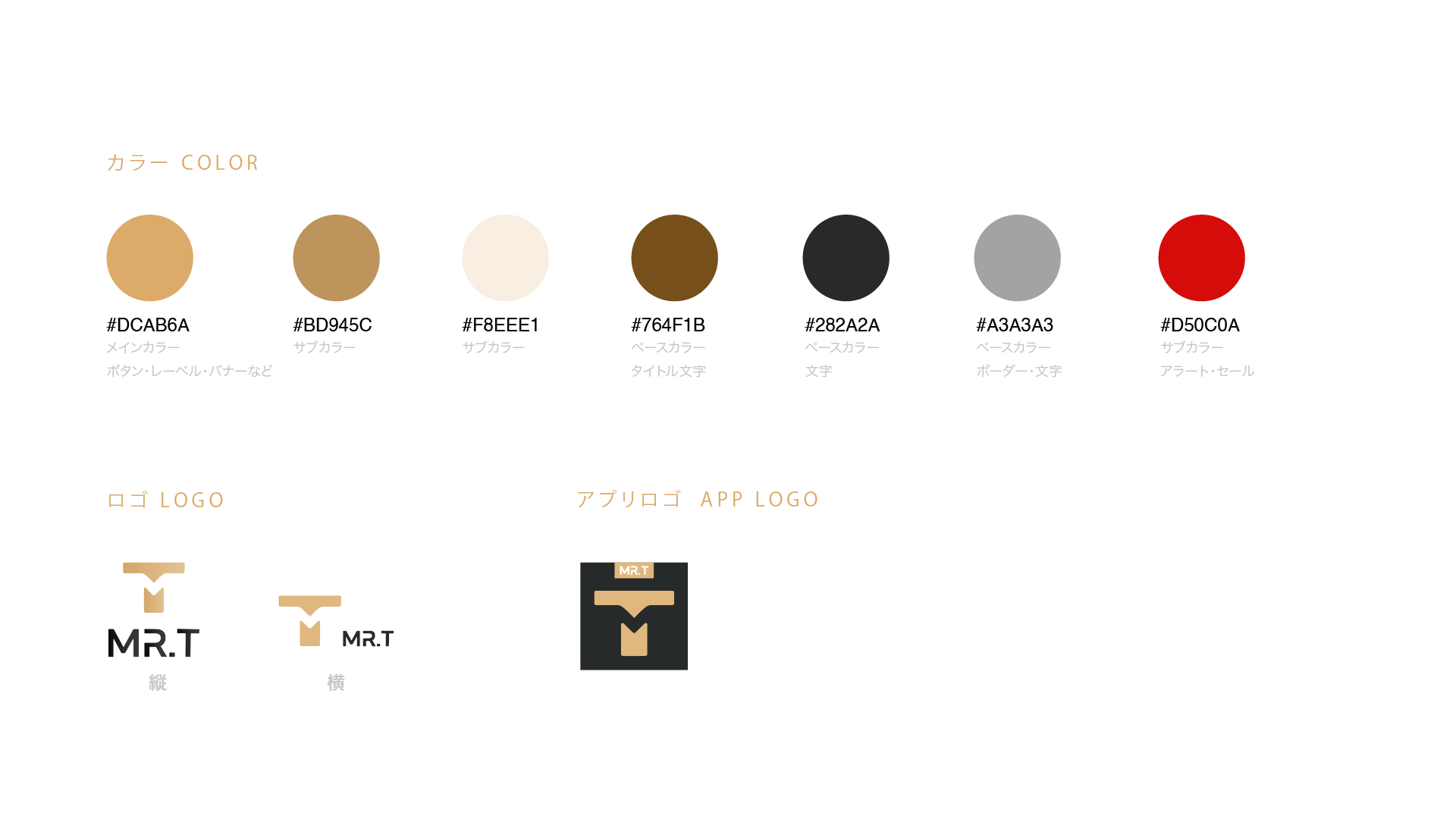
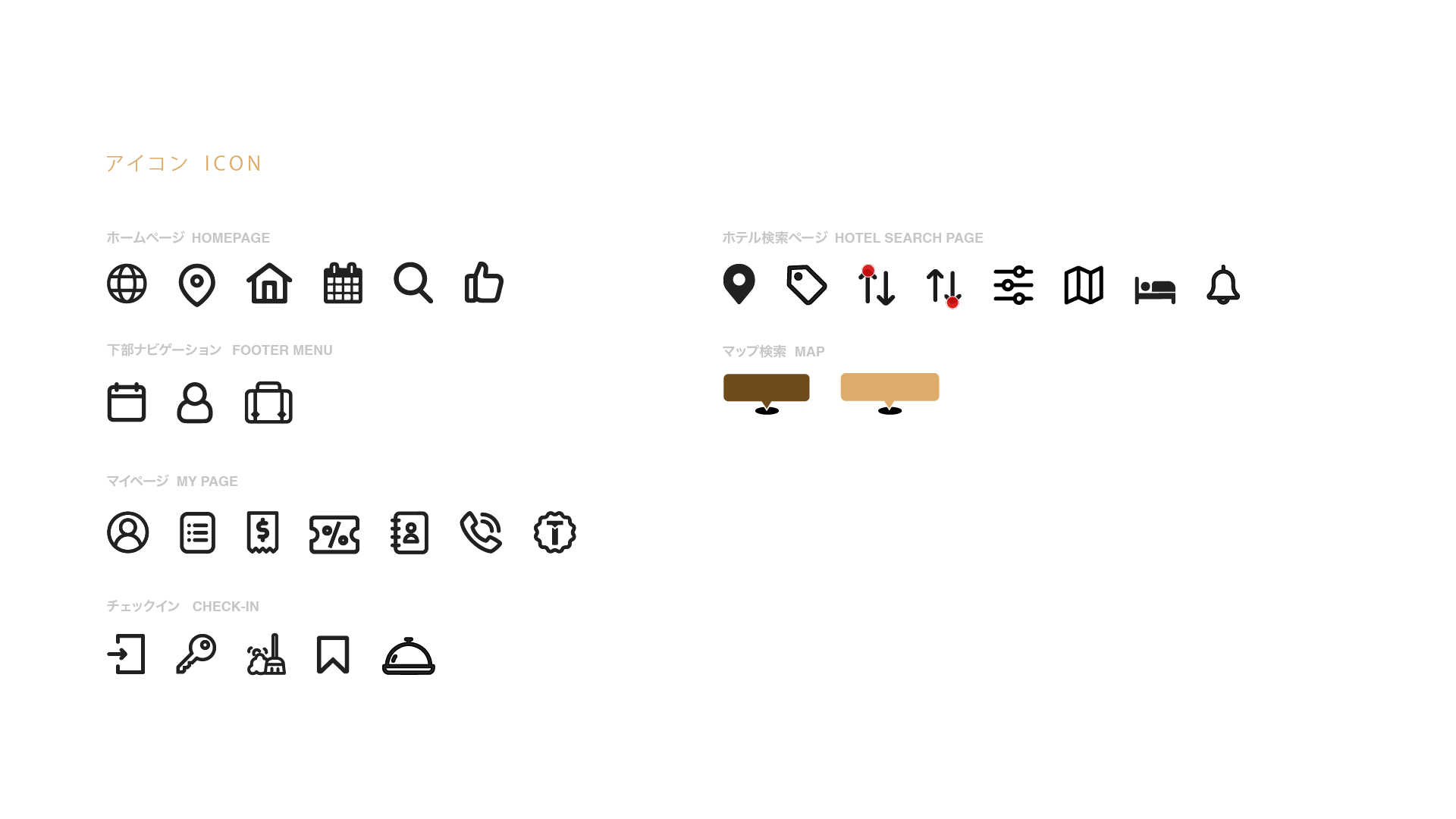
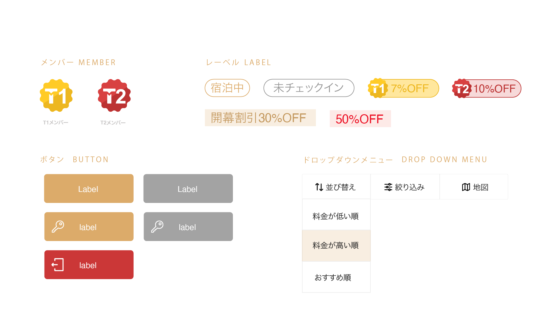
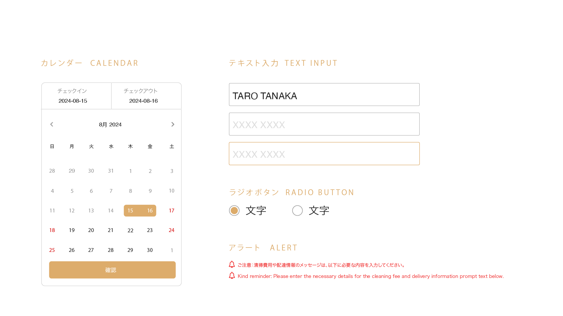
The first issue was that the app didn’t have a unified design system, which caused all the designs to be misaligned. My first task was to organize the existing layouts and design elements, including buttons, fonts, icons, colors, margins, and so on, and then create and establish a style guideline.
# ISSUE 2
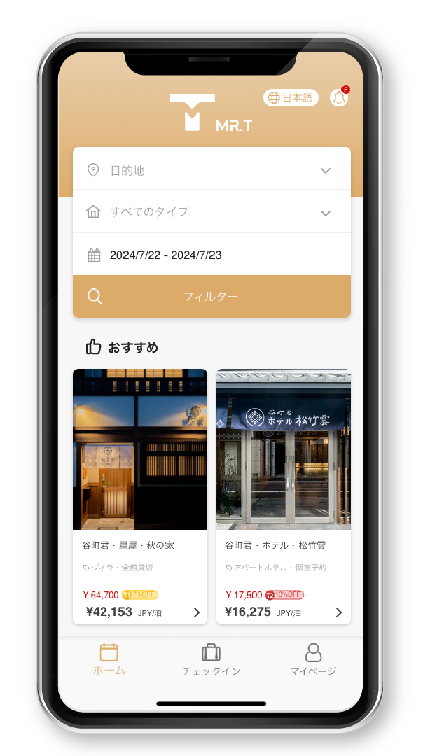
The second issue is that the app only had the basic searching and booking functions. To enhance the user experience for hotel bookings, I needed to add features like recommendations and filtering, making it easier for users to find their ideal hotels.
HOMEPAGE
I referred to several popular hotel booking apps like agoda.com, hotels.com, trip.com, etc. Based on that, I added a hotel recommendation section on the app’s homepage.
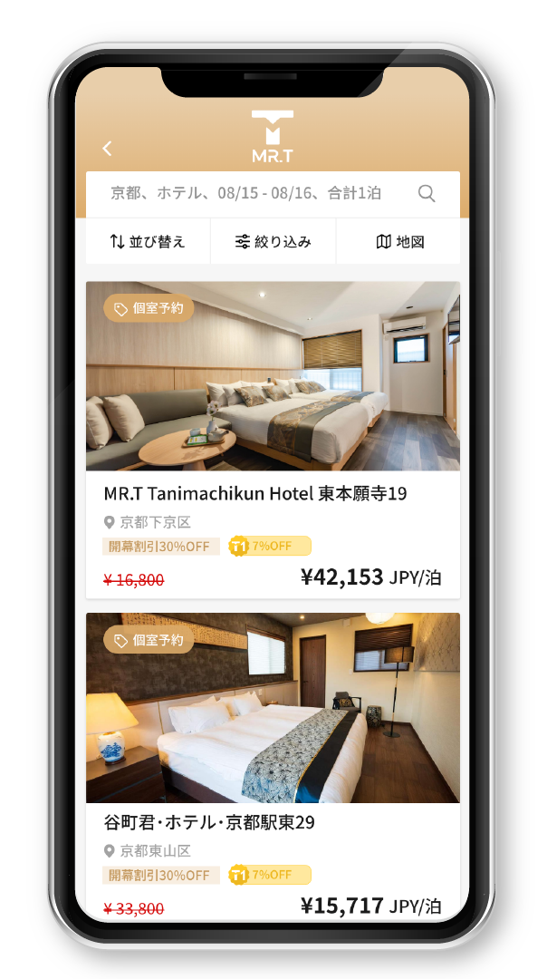
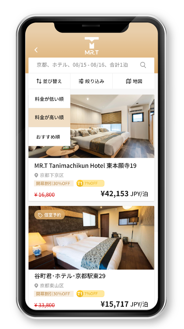
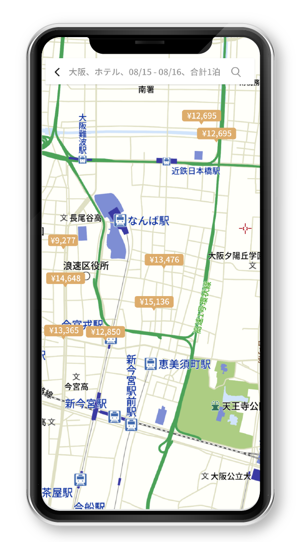
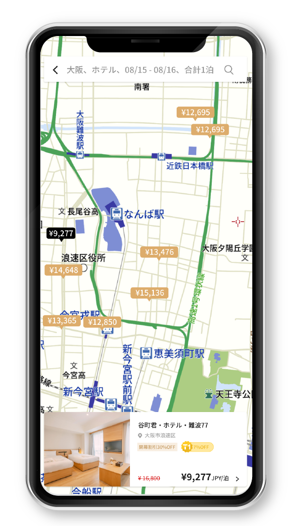
HOTEL SEARCH PAGE
# ISSUE 3
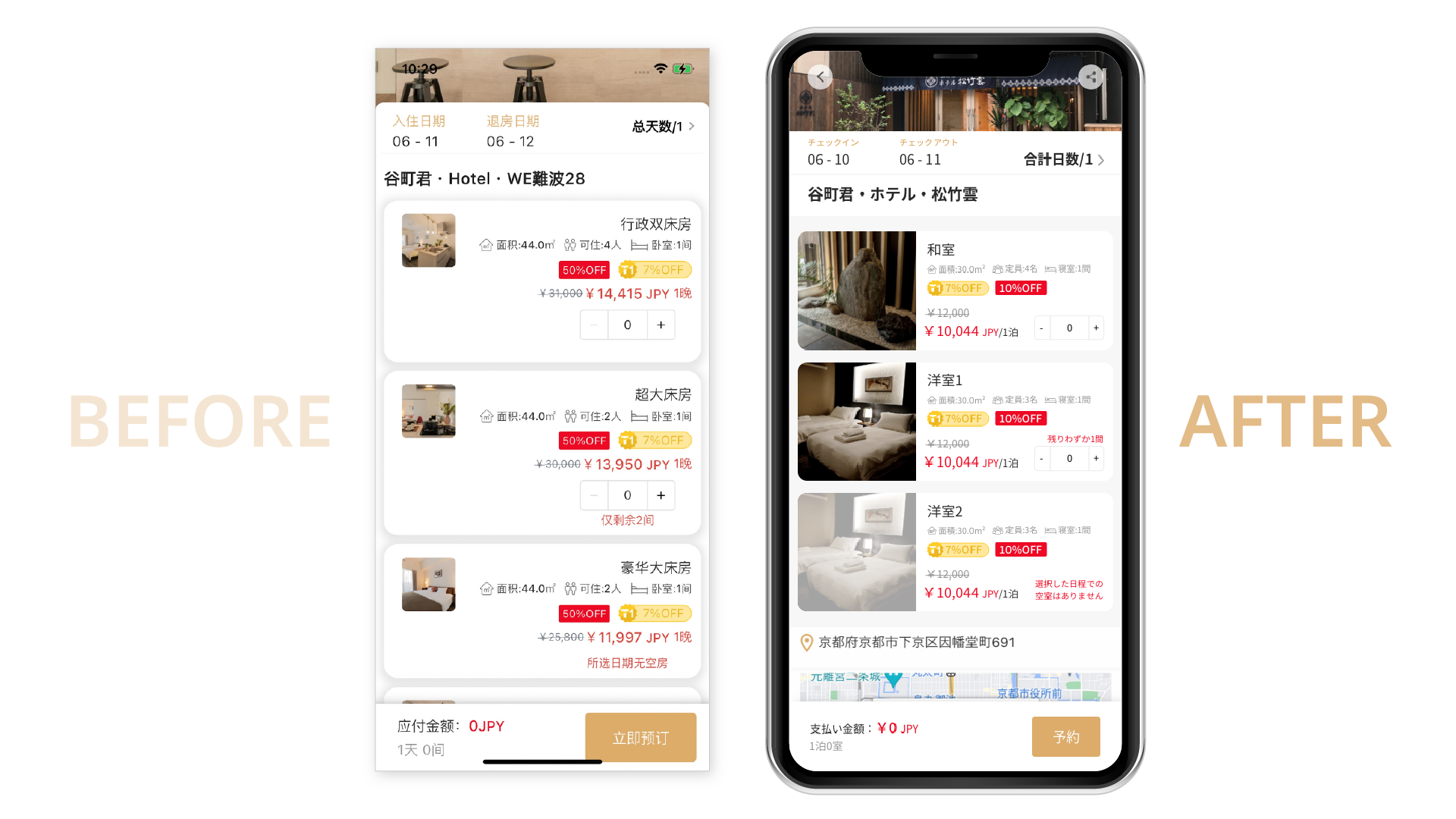
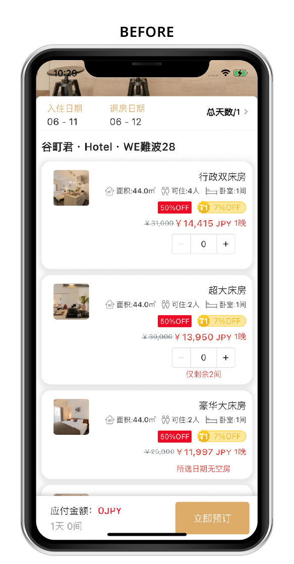
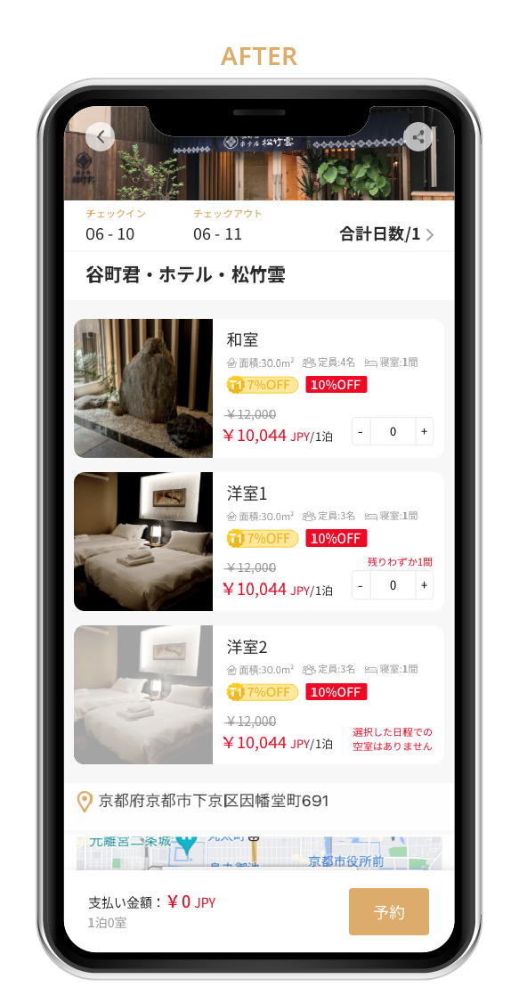
The layout of the hotel information page is also one of the tasks that need significant improvement. In the original page, the information is lacked of hierarchy, and the layout appeared cluttered. The hotel room images were also displayed too small, which negatively affected the user experience. Therefore, I redefined the hierarchy by adjusting the font size and weight based on the importance of the information. I also adjusted the layout’s ratio and spacing to make the key information stand out more.
HOTEL INFORMATION PAGE
# ISSUE 4
# ISSUE 5
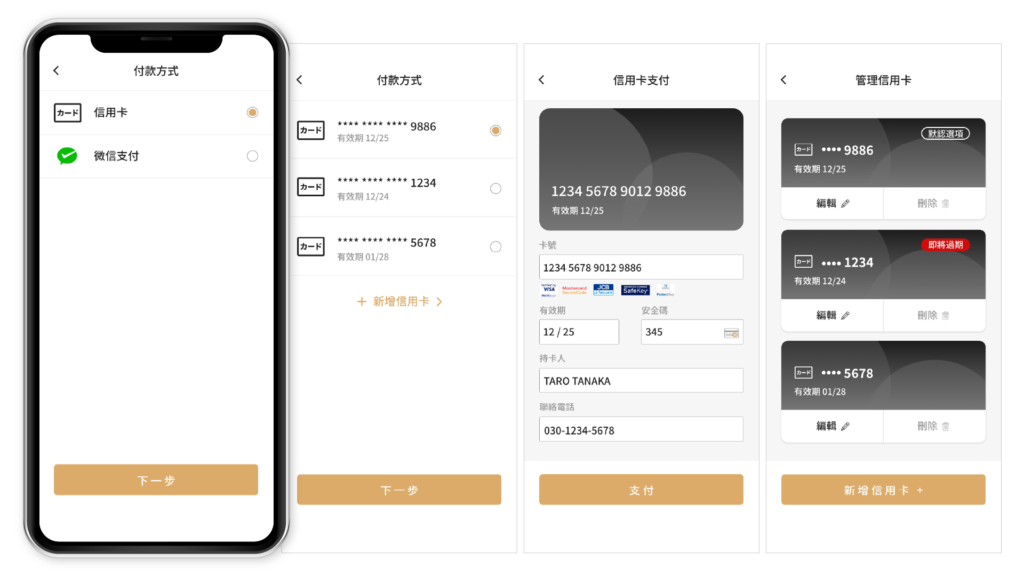
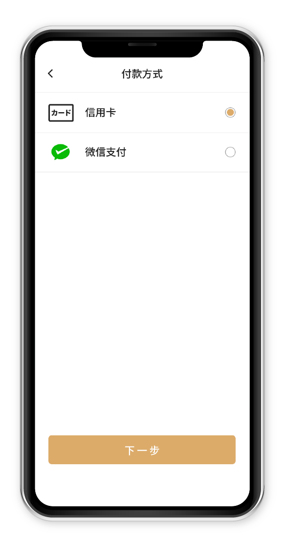
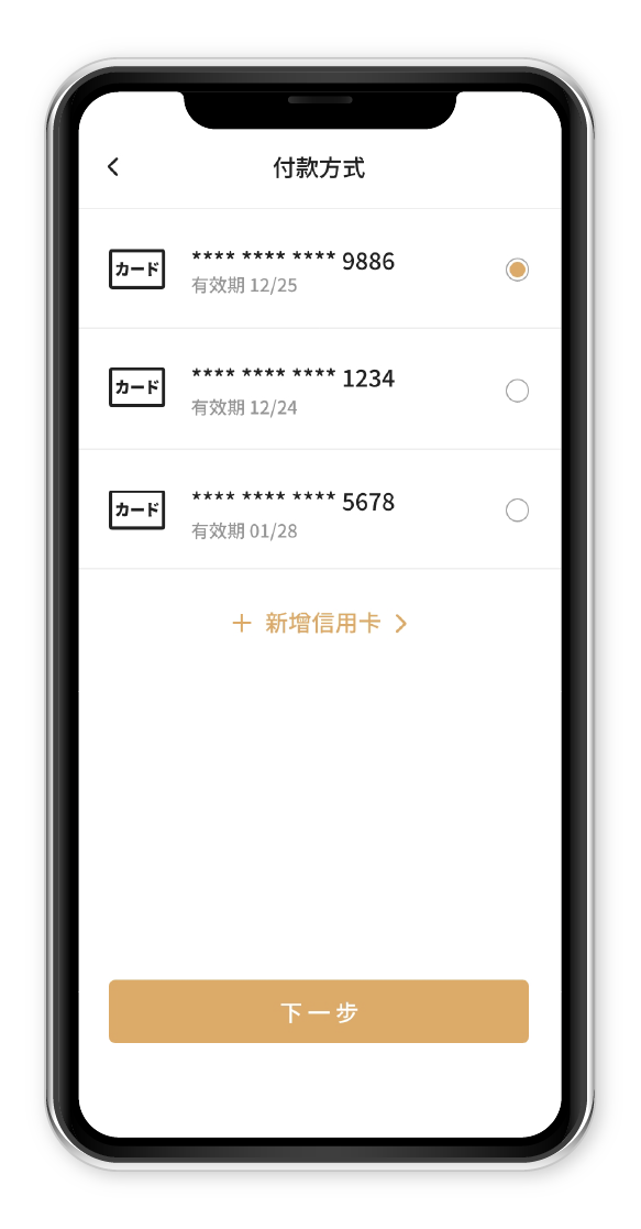
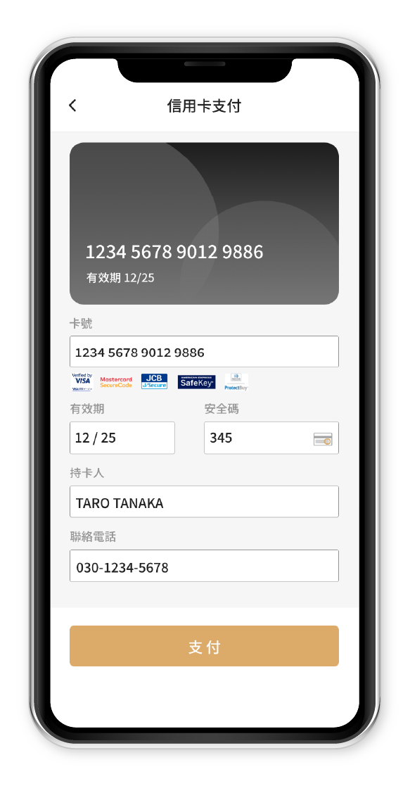
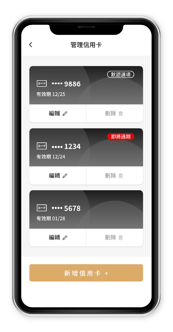
In addition, the app can also support various credit cards and WeChat Pay as payment methods. Therefore, I need to consider the layout of the payment method page, particularly focusing on the process of paying with different credit cards. This includes how to add different credit cards, the method of saving credit card information, and how to present options for editing credit card details.
